Hello, this is Hao.
I haven’t done TidyTuesday for a while, I am hoping writing this blog can keep me up with it. For those who is not familiar with TidyTuesday, it’s a weekly online community activity. Every Tuesday a data set is published on github, and everyone who participates will tweet about the insights they gain from cleaning and analyzing it. For more info, you can click here.
The data this week comes from the Berkeley Lab. See the technical brief on the emp.lbl.gov site.
Let’s load in the libraries and explore the data
library(tidyverse)
library(Hmisc)
Load in the 4 given data sets
rm(list = ls())
capacity <- readr::read_csv('https://raw.githubusercontent.com/rfordatascience/tidytuesday/master/data/2022/2022-05-03/capacity.csv')
wind <- readr::read_csv('https://raw.githubusercontent.com/rfordatascience/tidytuesday/master/data/2022/2022-05-03/wind.csv')
solar <- readr::read_csv('https://raw.githubusercontent.com/rfordatascience/tidytuesday/master/data/2022/2022-05-03/solar.csv')
average_cost <- readr::read_csv('https://raw.githubusercontent.com/rfordatascience/tidytuesday/master/data/2022/2022-05-03/average_cost.csv')
Let’s take a look at average_cost
describe(average_cost)

average_cost %>%
  gather(energy_source, cost, -year) %>%
  ggplot(aes(year, cost)) +
  geom_col(aes(fill = energy_source), show.legend = F) +
  facet_wrap(~ energy_source)+
  labs(title = "Energy cost changes by year",
       x = "",
       y = "Cost in Dollars")
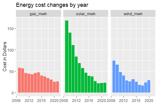
Analysis: from the year of 2008 to 2020, solar energy cost has decreased the most, with gas energy drops the least, wind reached its lowest point around 2017, then cost went back up
Let’s look at capacity data set
describe(capacity)

capacity %>%
  ggplot(aes(year, total_gw, color = type)) +
  geom_line(show.legend = F) +
  facet_wrap(~type, scales = "free") +
  labs(title = "Capacity change by year",
       x = "",
       y = "Capacity in GigaWatt")
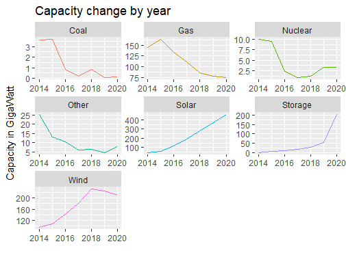
Analysis: from the year of 2014 to 2020, renewable energy (solar and wind) capacities are increasing, non-renewable energy source (coal, gas, nuclear and others) capacities are going down.
Let’s see what we can learn from solar and wind data sets
I use the gather() function, so I can compare price and capacity on the same plot
solar <- solar %>%
  rename(price = solar_mwh,
         capacity = solar_capacity)

solar %>%
  gather(variables, value, -date) %>%
  ggplot(aes(date, value, color = variables)) +
  geom_line() +
  geom_smooth(method = lm) +
  labs(title = "How does solar capacity affect price",
       x = "",
       y = "")
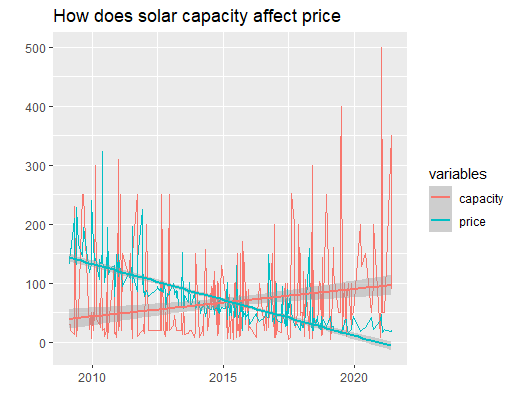
Analysis: seems the price of solar energy decreases as the capacity increases
wind %>%
  rename(price = wind_mwh,
         capacity = wind_capacity) %>%
  gather(variables, value, -date) %>%
  ggplot(aes(date, value, color = variables)) +
  geom_line() +
  geom_smooth(method = lm) +
  labs(title = "How does wind energy capacity affect its price",
       x = "",
       y = "")
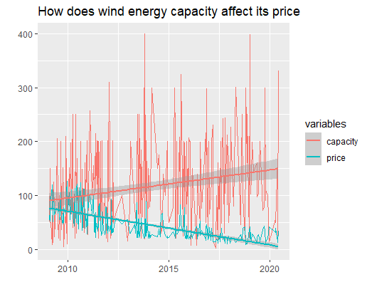
Analysis: the price of wind energy also decreases as the capacity goes up through the years
This week’s analysis are fairly easy, since the data sets are really clean, there were not much of data cleaning to do. Please let me know if you can find any other insights from this week’s data, cheers!