Hello, this is Hao.
As I was looking for more projects to practice, I came across with this virtual experience programe on theforage.com. The project is hosted by Accenture North America, and it’s called Navigating Numbers (full details can be found here). The goal for this project is to be “equipped with data fundamentals and an understanding of what a career in data analytics could look like”.
The project is devided into 4 modules: project understanding, data cleaning and modeling, data visualization and storytelling, present to the client. Immediately, the flow from understand the business tasks, clean and process the data, to create visualization to gain business insights, all sounded very similar to the Google Data Analytics courses, but with one big different, in order to complete the course and receive the certificate, a video presentation must be recorded and submitted.
Let’s get started.
Company Background
Social Buzz is a social media and content creation company founded in 2010, based in San Francisco. Over the past 5 years, it has reached over 500 million active users monthly. Every day over 100,000 pieces of content, ranging from text, images, videos and GIFs are posted.
Business Task
All the data users posted on Social Buzz is highly unstructured and requires extrememly sophisticated and expensive technology to manage and maintain. More than 80% of the employees are technical staff working on maintaining this highly complex technology. To start our engagement with Social Buzz, we are running a 3-month pilot program to prove to them that we are the best firm to work with to oversee their scaling process effectively.
Deliverables
- An audit of their big data practice
- Recommendations for a successful IPO
- An analysis of their content categories that highlights the top 5 categories with largest aggregate popularity
My Duty
As the data Analyst, I am primarily responsible for completing the hands-on analysis of data and find the top 5 popular categories of content, then translating the requirements of the project into insights.
Prepare the Data
The team has extracted a set of 7 sample data sets using SQL, my job is to make sense of the data and create my own data set to fulfill the requirements of this task.
I will use RStudio as the tool of choice for this module.
load in the libraries
library(tidyverse)
library(Hmisc)
library(lubridate)
library(janitor)
load in the 7 data sets provided for this project
rm(list = ls())
content <- read_csv("https://cdn.theforage.com/vinternships/companyassets/T6kdcdKSTfg2aotxT/Content%20(1).csv")

location <- read_csv("https://cdn.theforage.com/vinternships/companyassets/T6kdcdKSTfg2aotxT/Location%20(1).csv")

profile <- read_csv("https://cdn.theforage.com/vinternships/companyassets/T6kdcdKSTfg2aotxT/Profile%20(1).csv")

reaction <- read_csv("https://cdn.theforage.com/vinternships/companyassets/T6kdcdKSTfg2aotxT/Reactions%20(1).csv")

reaction_types <- read_csv("https://cdn.theforage.com/vinternships/companyassets/T6kdcdKSTfg2aotxT/ReactionTypes%20(1).csv")

session <- read_csv("https://cdn.theforage.com/vinternships/companyassets/T6kdcdKSTfg2aotxT/Session%20(1).csv")

user <- read_csv("https://cdn.theforage.com/vinternships/companyassets/T6kdcdKSTfg2aotxT/User%20(1).csv")
I will clean and explore each data set then decide which data set I will choose to merge into the final data set to find the 5 most popular categories.
1. content data set
# use describe function to see if there are any missing values
describe(content)
# remove unnecessary columns and clean column names
content <- content %>%
select(-"URL", -...1) %>%
clean_names()
glimpse(content)
# some category names have quotes on them and some don't, remove marks and change to lower case to keep consistency
content <- content %>%
mutate(category = gsub('[\"]', '', category)) %>%
mutate(category = tolower(category)) %>%
mutate(category = fct_recode(category, "public_speaking" = "public speaking"),
category = fct_recode(category, "healthy_eating" = "healthy eating"))
# rename some of the column names to prepare for joining datasets
content <- content %>%
rename(content_type = type)
# initial exploration of the 'content' dataset
content %>%
count(category, sort = TRUE) %>%
View()
# top 5 categories by content counts, but are they the 5 most popular?
content %>%
mutate(category = fct_lump(category, 5)) %>%
group_by(category) %>%
summarise(total = n()) %>%
arrange(desc(total))
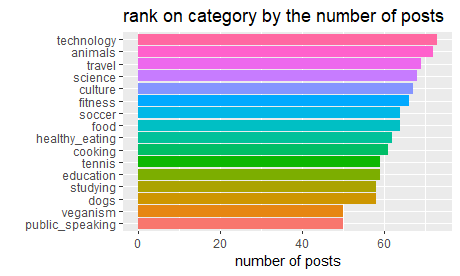
# distribution of categories
content %>%
group_by(category) %>%
summarise(n = n()) %>%
mutate(category = fct_reorder(category, n),) %>%
ggplot(aes(category, n, fill = category)) +
geom_col(show.legend = FALSE) +
coord_flip() +
labs(title = "rank on category by the number of posts", y = 'number of posts', x = '')
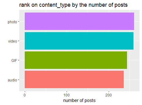
# distribution of content_type
content %>%
  group_by(content_type) %>%
  summarise(n = n()) %>%
  mutate(content_type = fct_reorder(content_type, n)) %>%
  ggplot(aes(content_type, n, fill = content_type)) +
  geom_col(show.legend = FALSE) +
  coord_flip()+
  labs(title = 'rank on content_type by the number of posts', y = 'number of posts', x = '')
2.location data set
describe(location)

# remove unnecessary columns and clean column names
location <- location %>%
  select(-...1) %>%
  clean_names()

#extract state and zip code from address then drop address column
location <- location %>%
  mutate(zip_code = str_sub(address, -5),
         state = str_sub(address, -8, -7)) %>%
  select(-address)

# initial exploration of the 2 new columns
location %>%
  count(state, sort = TRUE) %>%
  View()
location %>%
  count(zip_code, sort = TRUE)
glimpse(location)
3. profile
describe(profile)

# remove unnecessary columns
profile <- profile %>%
  select(-'...1', -'Age')

# clean Interests column, separate each category into its own rows and remove marks
profile <- profile %>%
  separate_rows(Interests, sep = ',') %>%
  mutate(Interests = str_replace(Interests, "\\'", "")) %>%
  mutate(Interests = str_replace(Interests, "\\[", "")) %>%
  mutate(Interests = str_replace(Interests, "\\]", "")) %>%
  mutate(Interests = str_replace(Interests, "\\'", "")) %>%
  mutate(Interests = str_replace(Interests, " ", "")) %>%
  clean_names()

# recode some of the misspelled names
profile <- profile %>%
  mutate(interests = fct_recode(interests, "public_speaking" = "public speaking"),
         interests = fct_recode(interests, "public_speaking" = "publicspeaking"),
         interests = fct_recode(interests, "healthy_eating" = "healthy eating"),
         interests = fct_recode(interests, "healthy_eating" = "healthyeating"))


profile %>%
  count(interests, sort = TRUE)
4. reaction
describe(reaction)
# looking into datetime column, extracting the month, day, weekday and hour info for initial exploration in R
# also remove unnecessary columns and clean col names
reaction <- reaction %>%
mutate(Month = month(Datetime, label = TRUE),
Day = day(Datetime),
Weekday = wday(Datetime, label = TRUE),
Hour = hour(Datetime)) %>%
clean_names() %>%
select(-(x1), -(user_id))
# rename type to reaction_type to prepare the final data set
reaction <- reaction %>%
rename(reaction_type = type)
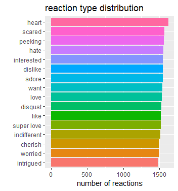
# reaction type distribution
reaction %>%
filter(!is.na(reaction_type)) %>%
group_by(reaction_type) %>%
summarise(total = n()) %>%
mutate(reaction_type = fct_reorder(reaction_type, total)) %>%
ggplot(aes(total, reaction_type, fill = reaction_type))+
geom_col(show.legend = F) +
labs(title = 'reaction type distribution', x = 'number of reactions', y = '')
# initial exploration on the time variables
reaction %>%
  group_by(month) %>%
  summarise(total = n()) %>%
  ggplot(aes(month, total, group = 1))+
  geom_line()+
  expand_limits(y = 0)+
  labs(title = 'reactoin count by month', x = '', y = '')

reaction %>%
  group_by(weekday) %>%
  summarise(total = n()) %>%
  ggplot(aes(weekday, total, group = 1))+
  geom_line()+
  expand_limits(y = 0)+
  labs(title = 'reaction count by weekday', x = '', y = '')

reaction %>%
  group_by(hour) %>%
  summarise(total = n()) %>%
  ggplot(aes(hour, total, group = 1))+
  geom_line()+
  expand_limits(y = 0)+
  labs(title = 'reaction count by hour', x = '', y = '')
5. reaction_types
# remove unnecessary columns, clean col names, and rename type to reaciton_type
reaction_types <- reaction_types %>%
  select(-"...1") %>%
  clean_names() %>%
  rename(reaction_type = type)

# what kind of reaction_types have high scores
reaction_types %>%
  arrange(desc(score))

# sentiment distribution
reaction_types %>%
  count(sentiment, sort = TRUE)
6. session
# remove unnecessary columns, clean col names

session <- session %>%
  select(-...1) %>%
  clean_names()
7. user data set
# remove unnecessary columns, clean col names
user <- user %>%
  select(-...1) %>%
  clean_names()
After cleaning and some initial analysis, this is what I learned:
My duty is to find out the top 5 most popular categories, it should be based on the content reactions, not the count of how many posts of content in each category. I will use the score system from the reaction type data set to calculate the ranks. To complete this task, I will only use location, content, reaction and reaction_type these 4 data sets for my final data set.
# first let's join the tables
buzz_full <- location %>%
right_join(content, by = 'user_id') %>%
left_join(reaction, by = 'content_id') %>%
left_join(reaction_types, by = 'reaction_type')
# export the dataset for future analysis
write.csv(buzz_full, "C:\\Users\\haoli\\Desktop\\buzz_full.csv")
# then we can use the aggregated score to rank the categories
buzz_full %>%
group_by(category) %>%
summarise(total_score = sum(score, na.rm = T)) %>%
arrange(desc(total_score))
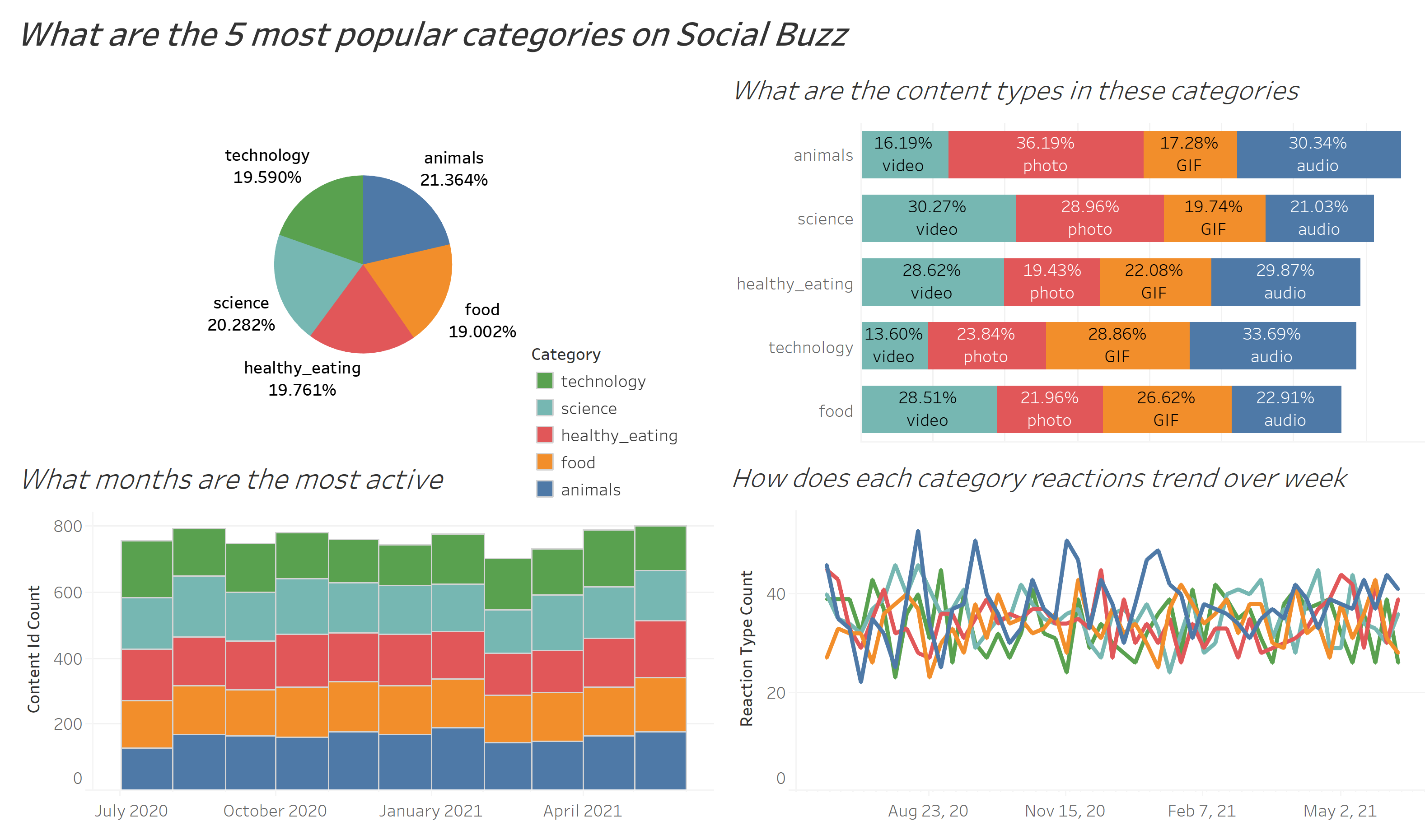
# the top 5 categories are: animals, science, healthy_eating, technology, food
social_buzz_top5 <- buzz_full %>%
filter(category %in% c("animals", "science", "healthy_eating", "technology", "food"))
write.csv(social_buzz_top5, "C:\\Users\\haoli\\Desktop\\social_buzz_top5.csv")
After using Tableau for further analysis, I found some interesting insights:
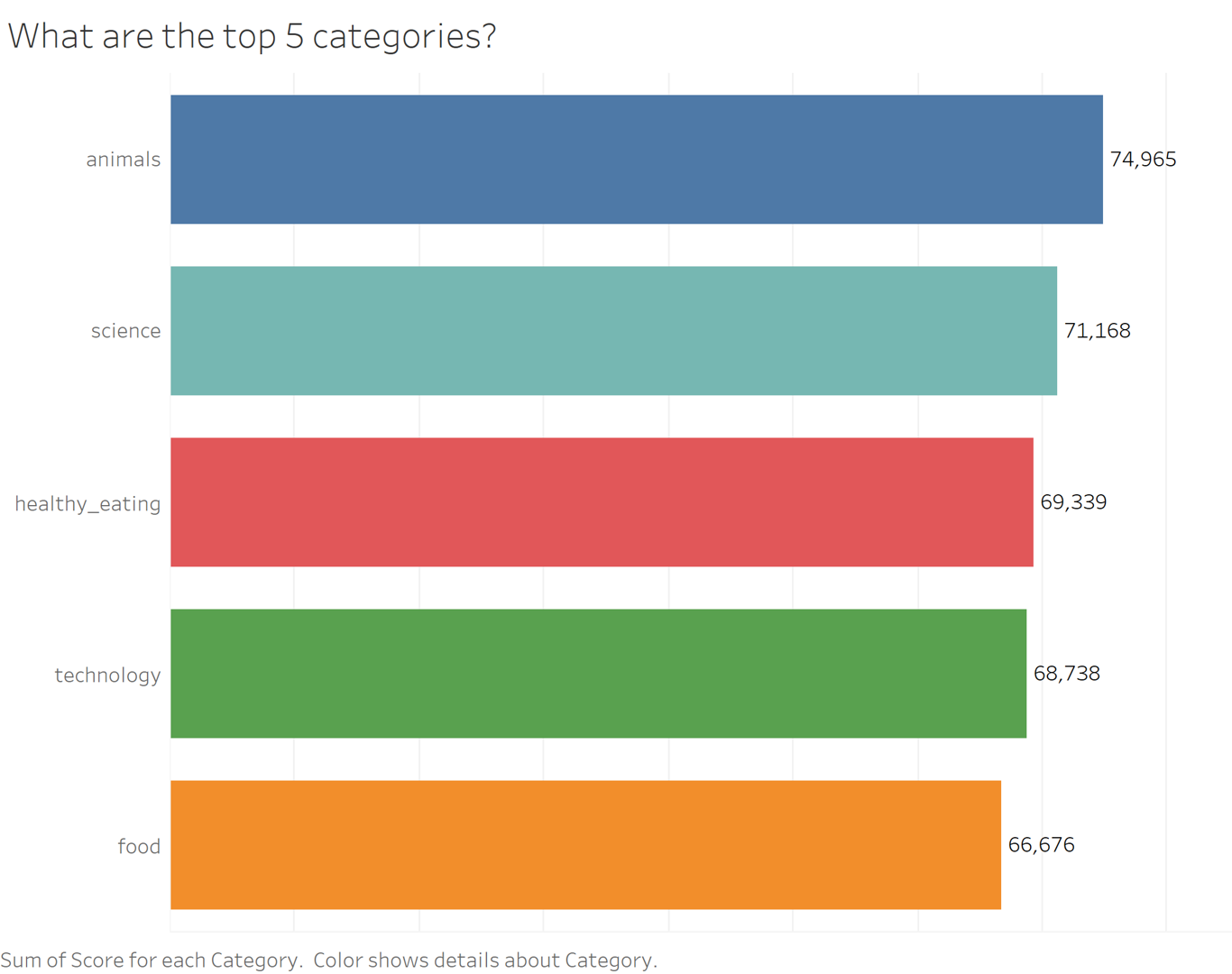
- Animals and science are the 2 most popular categories, suggesting that users like “real-life” content and have curious minds.
- It’s also interesting to see both healthy eating and food in the top 5, shows me users are pursuing a healthy life style.
- It’s not surprising to see technology in the top 5, since we lives have been changed so much by it, especially during the pandemic time. It presents a huge opportunity for the company to differentiate their platform and run specific content on it.
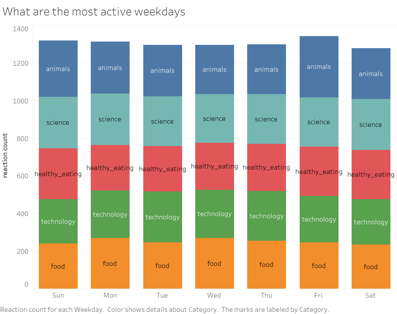
- Additoinally, the most active weekdays are Fridays, Sundays and Mondays, their marketing team can focus on those days for promotions and product launches.
 For the interactive Tableau dashborad, please click here.